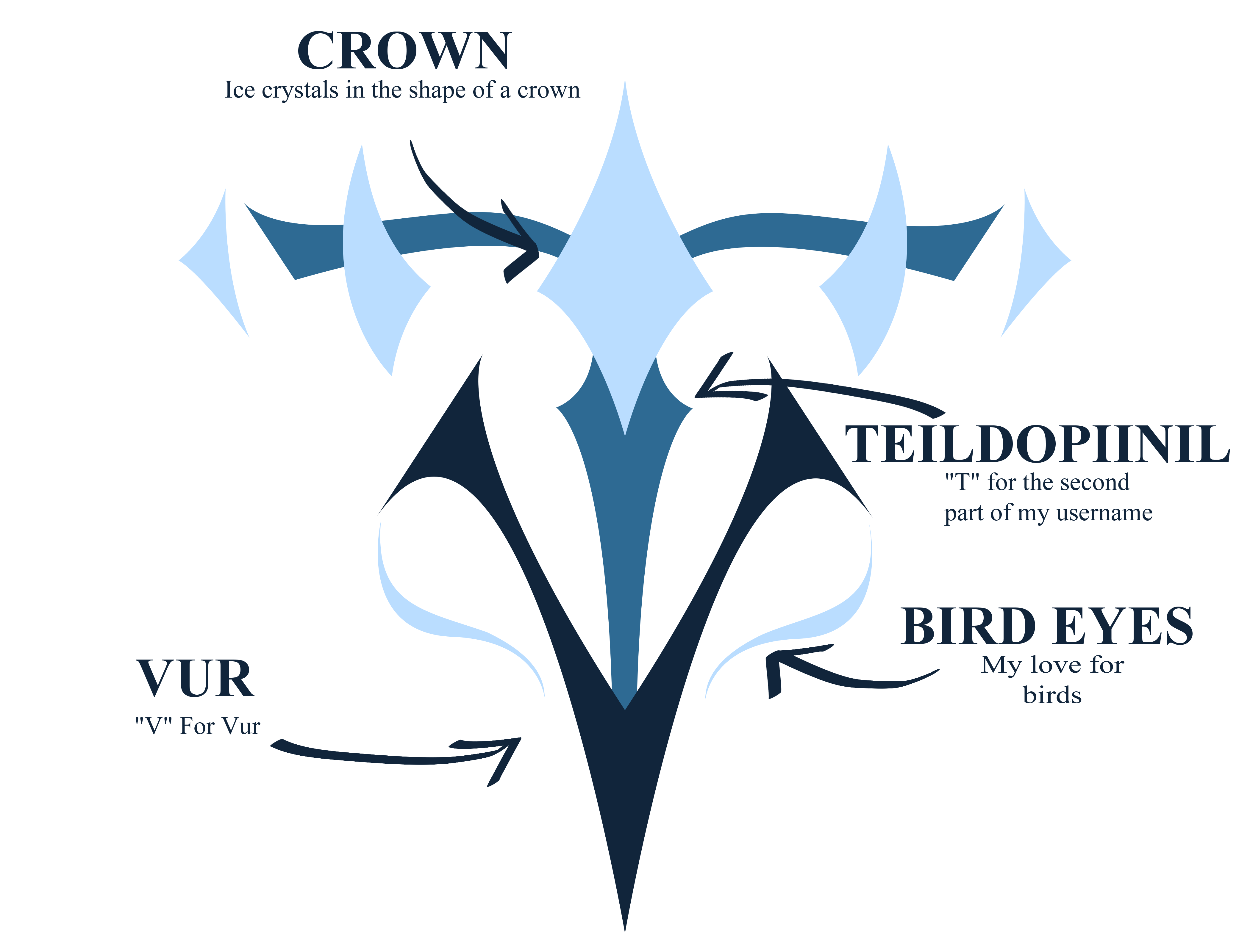
Logo Rationale
This logo is a visual representation of the brand's core values. The sharpness of the Logo embodies the brand's commitment to precision and attention to detail, while the fluidity of the design reflects the ever evolving nature of creativity. The crown part is for the artists control over his work and the creative process; the bird eyes are both a symbol of freedom over the art and the artists adoration for birds; and the blue hues are for maintaining the icy and calm aesthetic of the brand. The colour hierarchy is also carefully considered, with the darker shades representing depth and the lighter shades symbolizing openness and approachability.
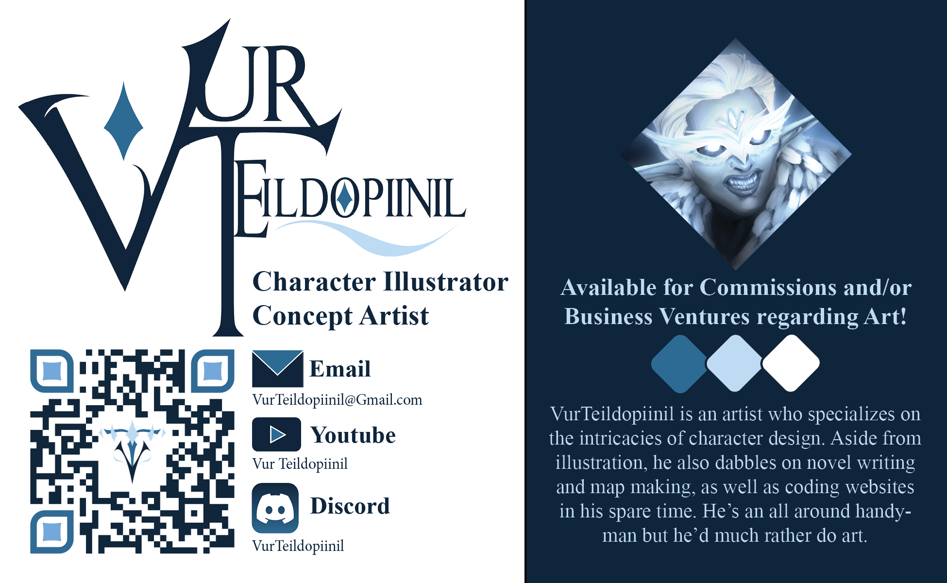
Business Card Rationale
The business card design is a reflection of the brand's commitment to professionalism and attention to detail. The front of the card features the artists contact information prominently, with a clean and easy to read format that ensures that all the important details are easily read. It also features a QR code that directs to the artists portfolio, further adding to the card's functionality and user experience.
The back of the card features the logo prominently. The use of negative space creates a sense of balance and harmony, while the blue hues maintain the icy and calm aesthetic of the brand.
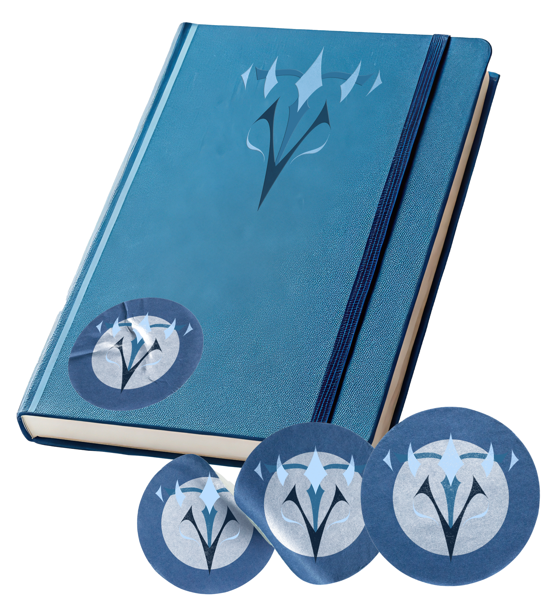
Merch Rationale
The merch products are specifically chosen to be paired with each other, with the notebook being a key component of being an artist. The goal is to provide artists with the tools they need to express their creativity and bring their ideas to life.
These merchandise extend the brand's identity beyond the digital realm, allowing artists to engage with their creativity in a tangible way.